A high-end custom home builder with twenty years of earned reputation — and a brand that no longer reflected the clients they'd grown into.
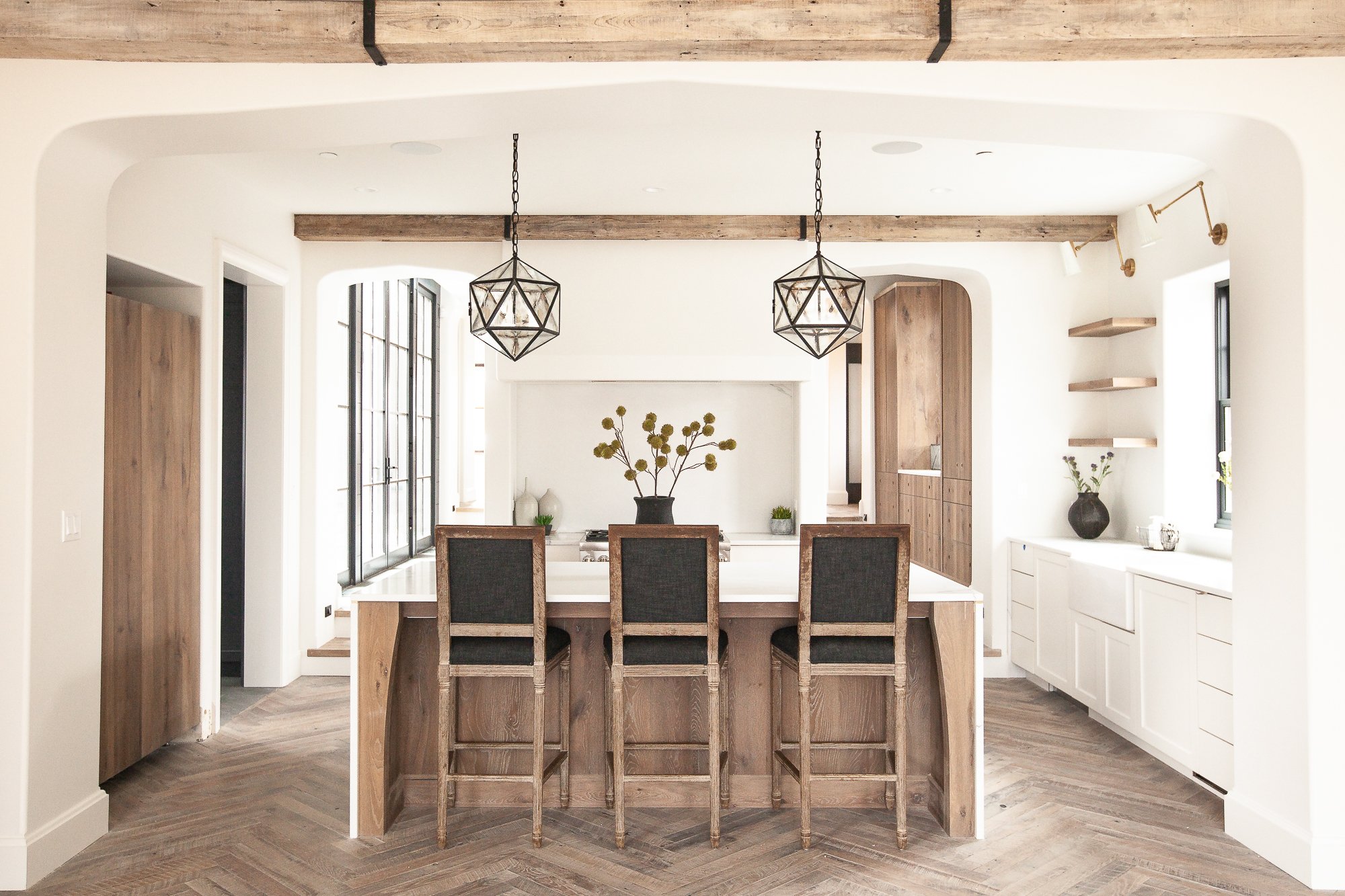
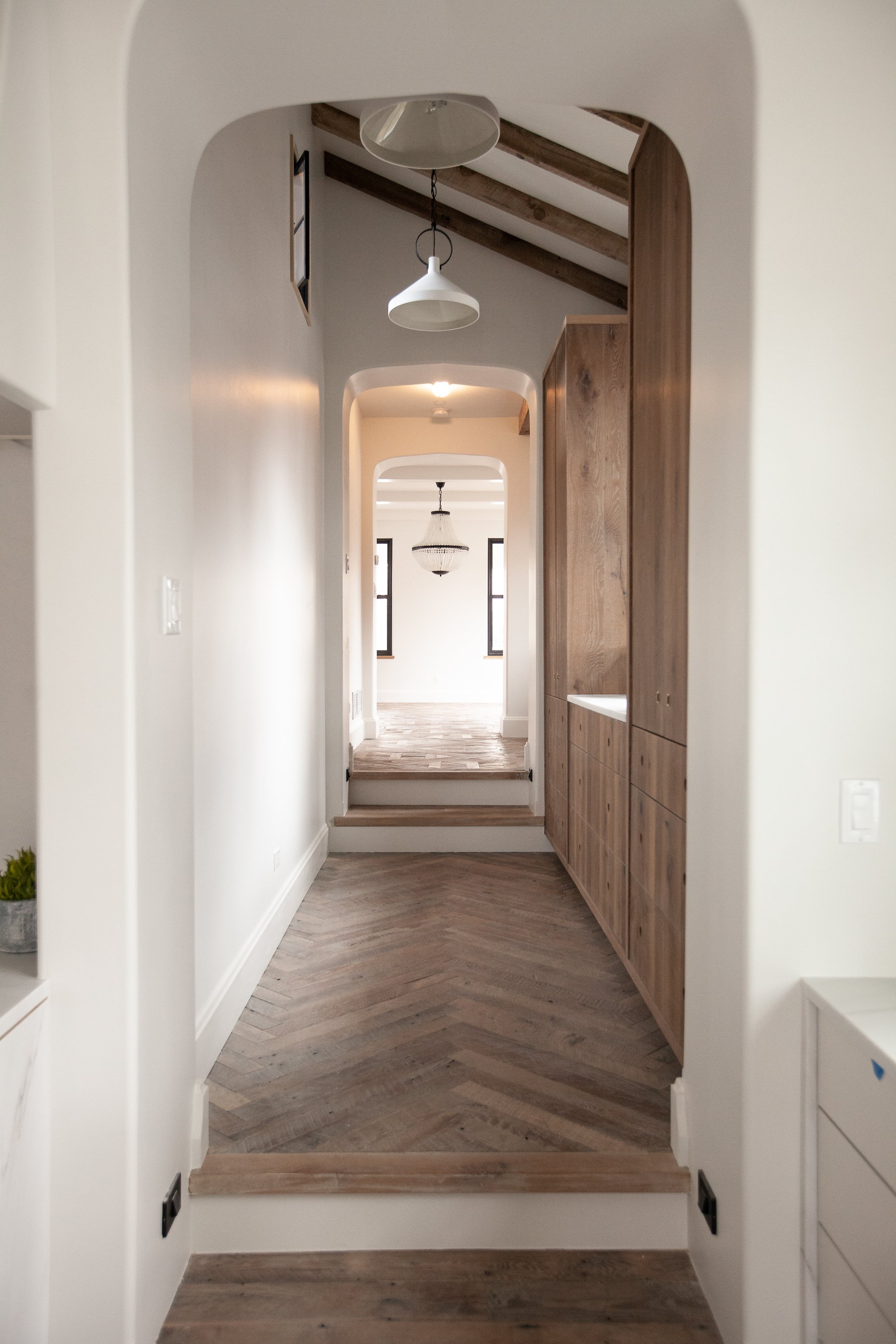
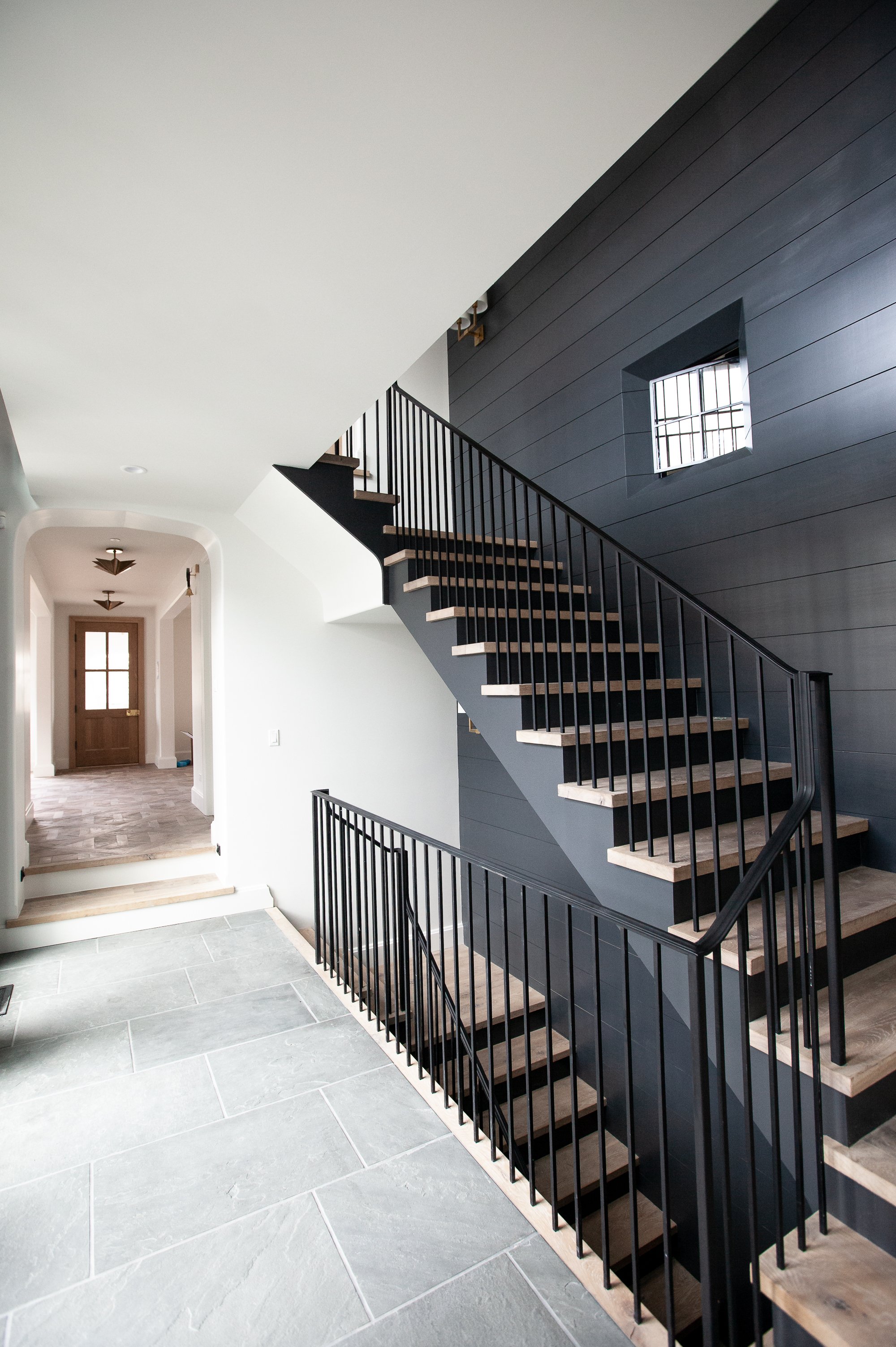
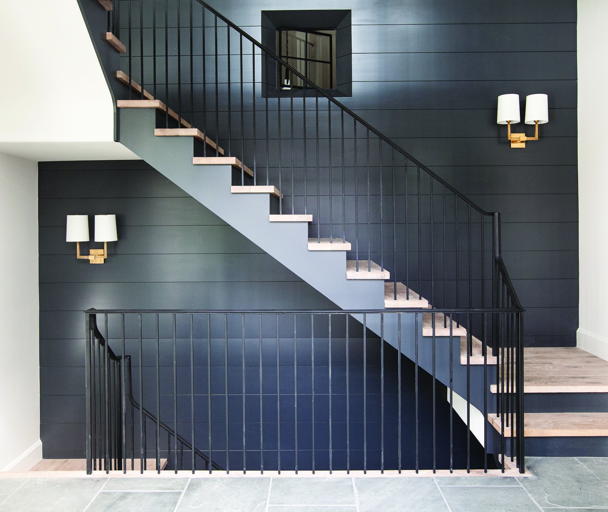
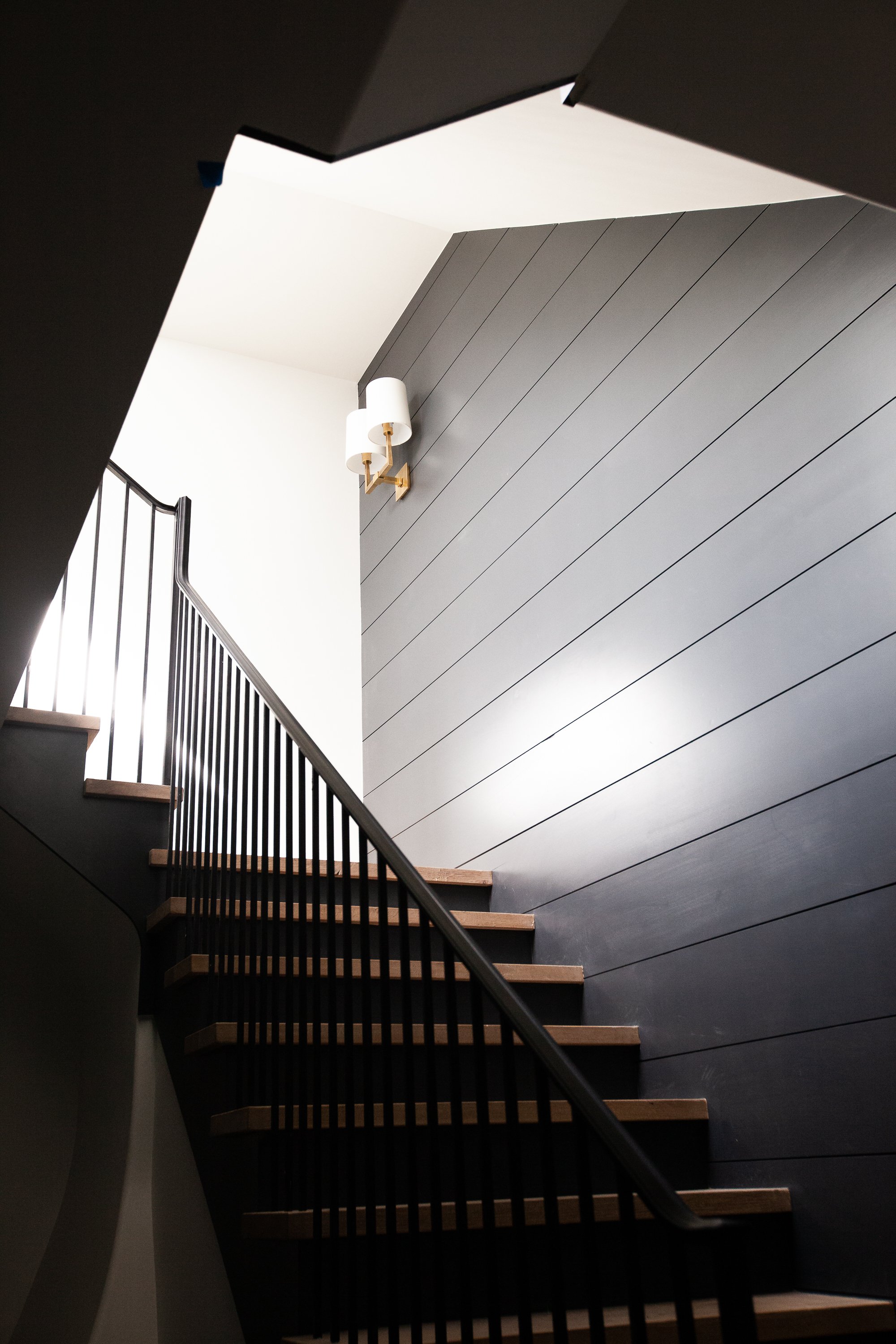
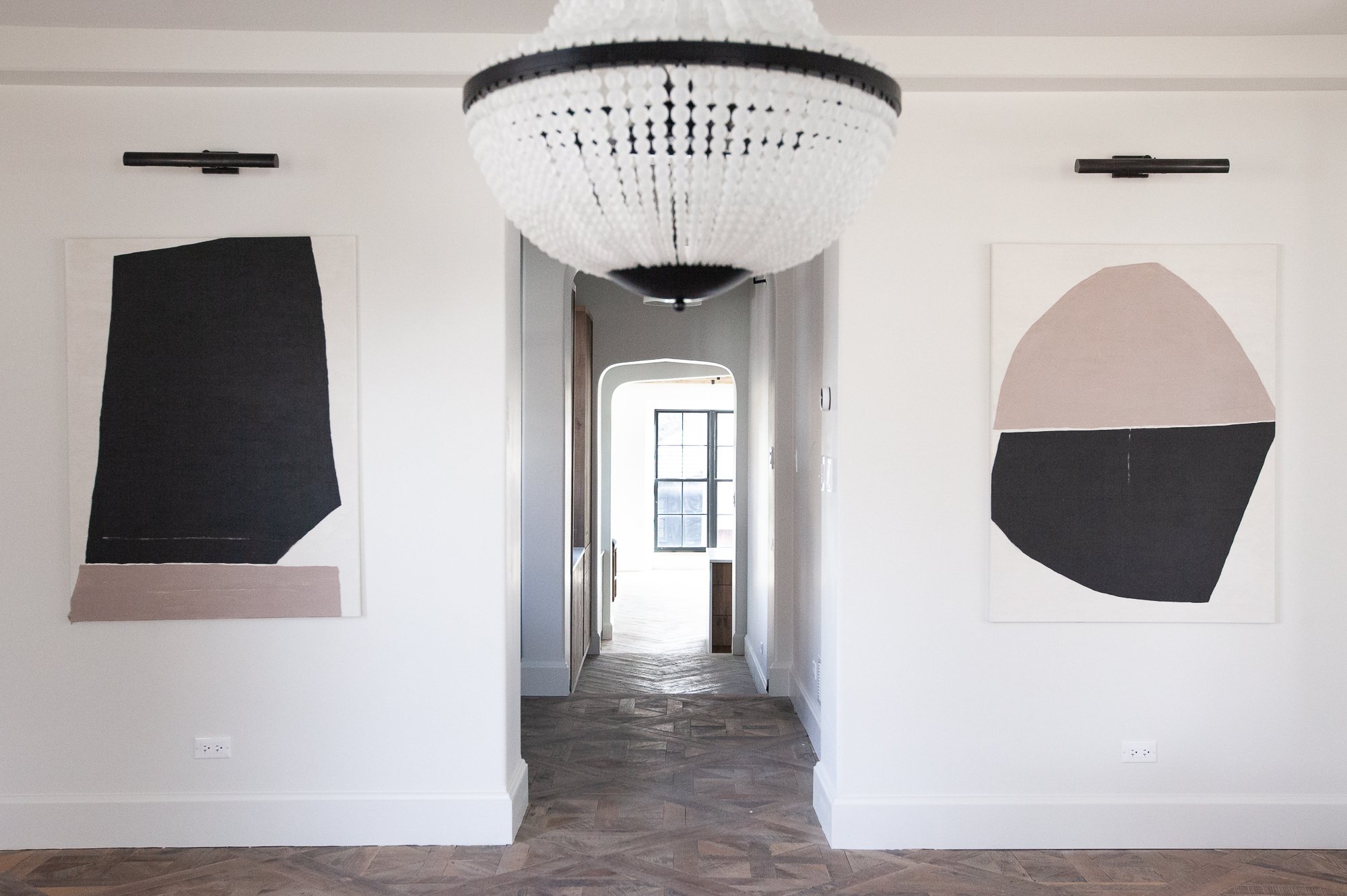
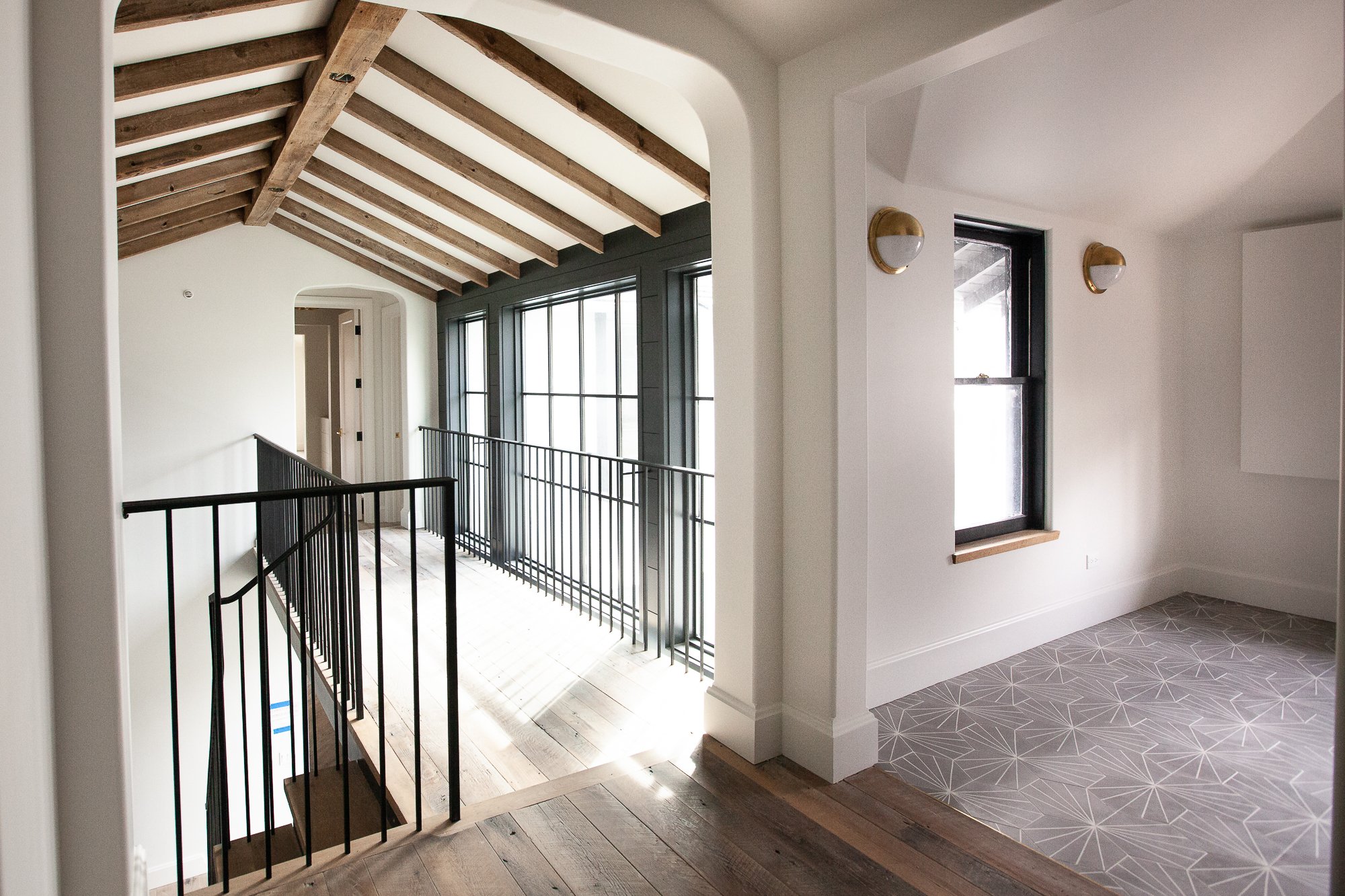
Grand Traditions had built a genuine legacy in custom home building. The challenge wasn't awareness — it was alignment. Their old-world traditional brand spoke to who they had been, not who they were becoming. Their architecture had evolved toward clean, contemporary luxury. Their brand hadn't followed.
The rebrand began with a single question: what do Grand Traditions' most selective clients actually buy? Not a house — a statement. The new identity was built around that insight. The mark — a nail intersecting building materials — is simple, structural, and honest about craft. It carries the weight of a heritage brand without the heaviness of one.
The identity rolled out across every client touchpoint: letter-pressed business cards with metallic painted edges, environmental signage, marketing materials, social media advertising, and a complete website redesign — moving from an outdated presence to one that could hold its own against the homes it represented.
Branding & Digital & Environmental Design
Brand strategy · Identity system · Website design · Environmental signage · Print collateral · Social media advertising · Marketing materials · Photography
Old Logo
Twenty years of equity, modernized without losing the craft that earned it.
New Logo
Vertical Logo.
Simple illustration showing the structure of the nail intersecting and joining building materials. It connotes the transparency of the building elements and the strength that comes with a simple hammer and nail.
Horizontal Logo.
The logo is designed so that it is consistent and can be used as a horizontal or vertical mark.


Letterpressed duplex business cards with metallic painted edges


Marketing Materials
Old Website
New Website


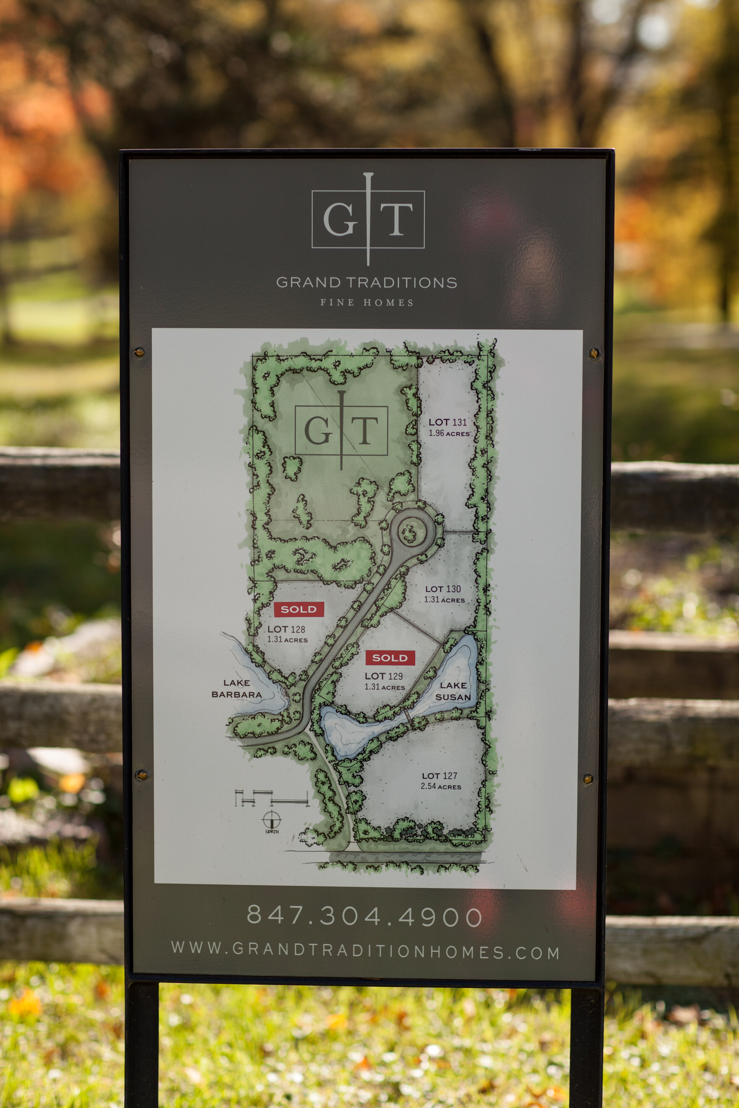
Environmental Signage


Social Media Advertising


Advertising


Old Rendering Style

New Rendering Style


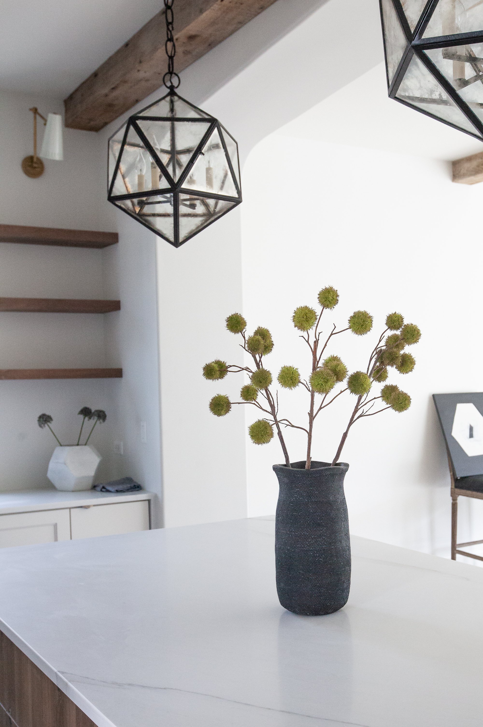
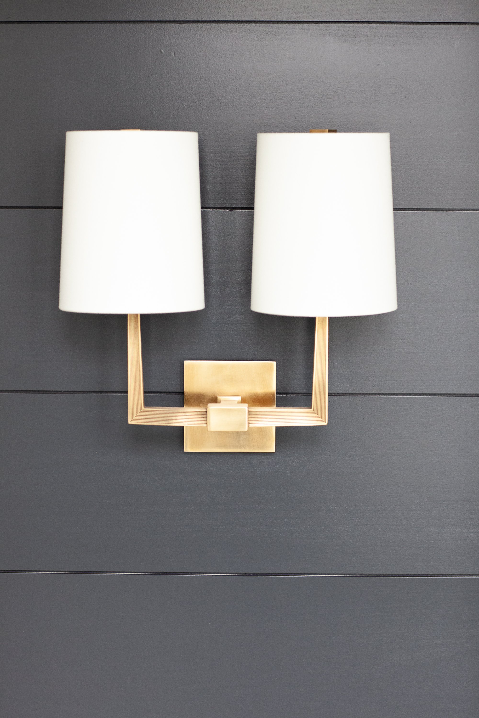
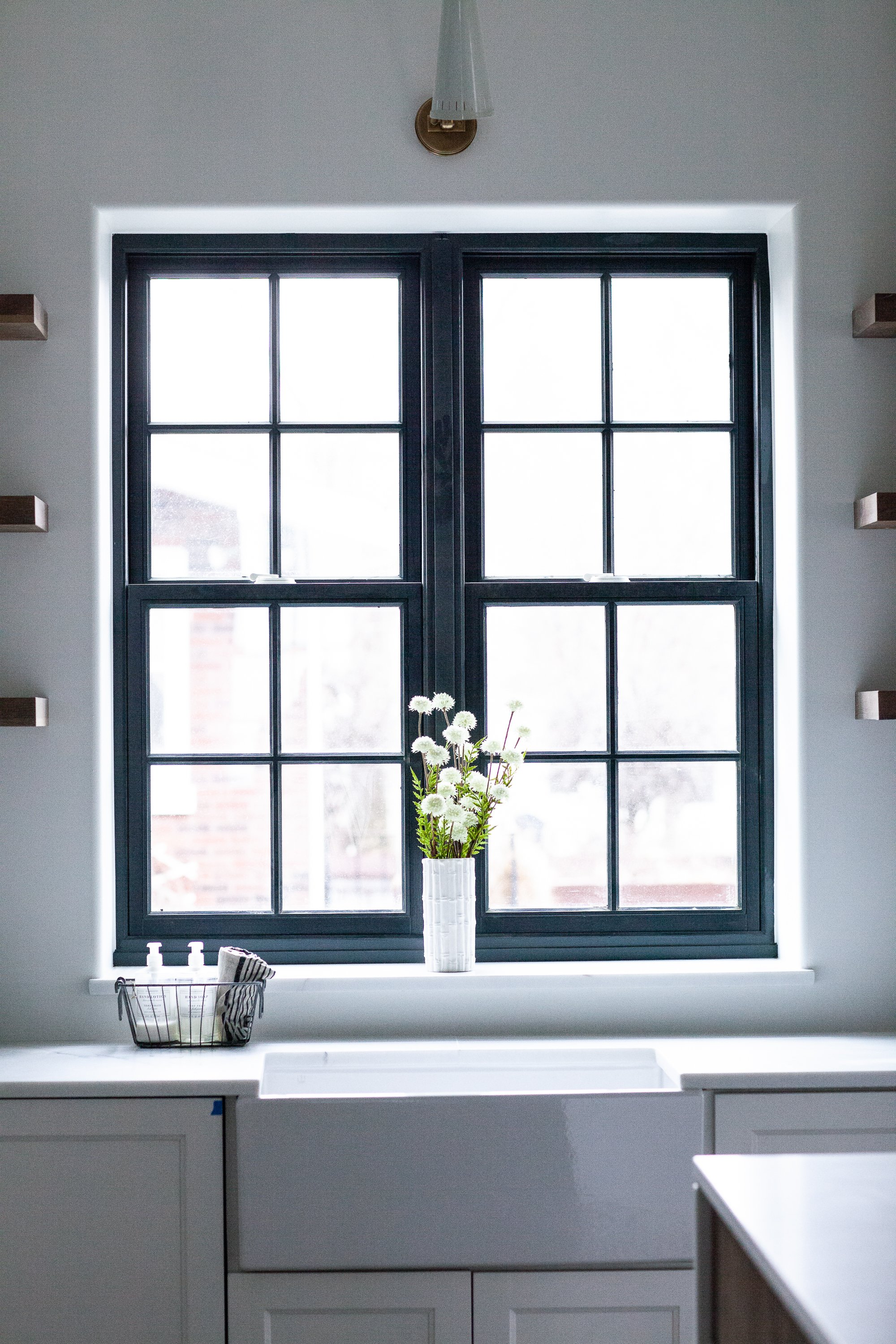
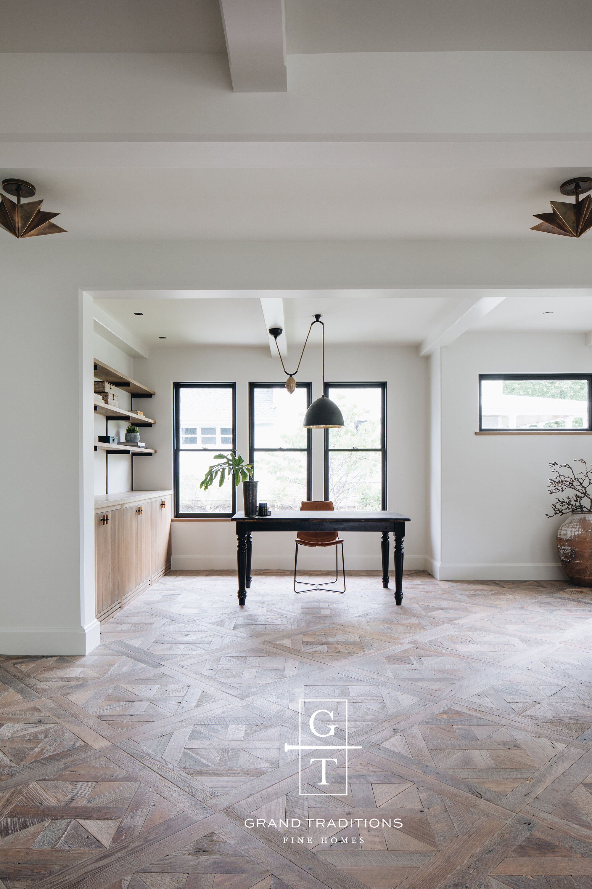
Photography