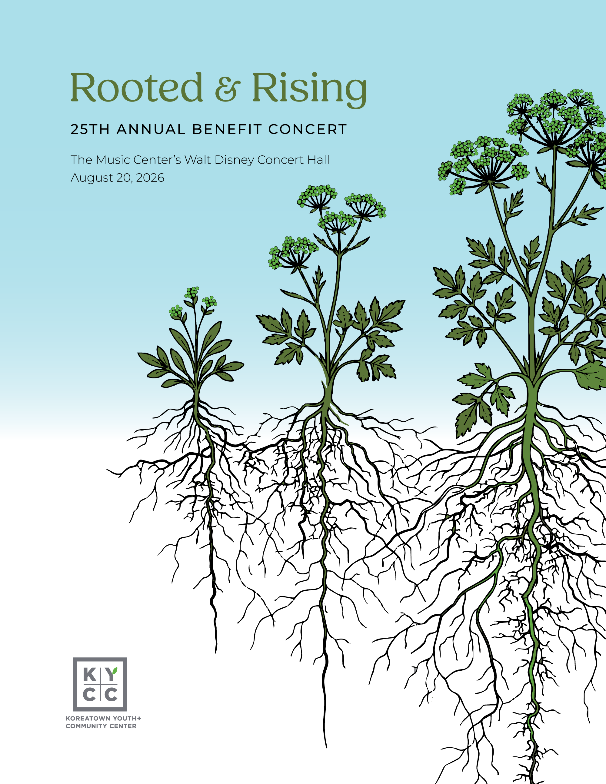
Three plants, three growth stages, one root system — that's not a metaphor KYCC could get away with using loosely. The Korean, African American, and Latino communities the organization serves don't share a culture or a history. What they share is the ground KYCC gives them to grow in.
Fundraising Brand Design
Color, Typography, Event program,
Annual Report
The temptation with a "three communities, one organization" brief is to flatten the differences — same plant, three colors, call it unity. KYCC's identity does the opposite: three distinct species, three different growth stages, each rendered with its own form and pace. What unifies them isn't sameness above ground, it's what's happening below it — root systems that reach toward each other in shared soil without merging the plants into one.
That distinction is the whole design problem this year, and it has to hold across two very different formats. The fundraiser program gets one night to make that idea felt by a room full of donors. The annual report, sharing the same palette and type, gets the rest of the year to make it legible as actual outcomes and numbers.