A school annual report usually splits into two documents wearing one cover — the photography that makes a parent feel something, and the data that makes a school board accountable. Stevenson needed those to stop taking turns.
Design & Production
Infographics intertwined with photography
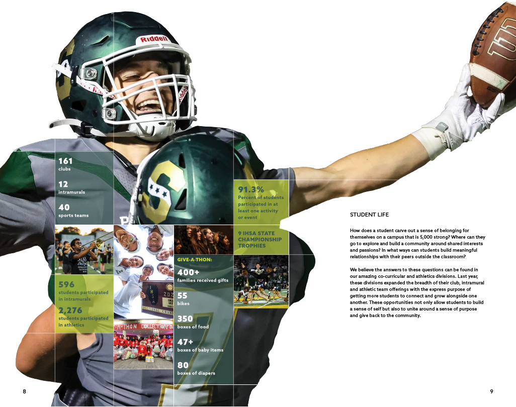
The fix wasn't placing photography and statistics side by side — it was nesting one inside the other. Every spread's imagery is masked and layered so that the relevant numbers are cut directly into the photo itself, sized and positioned like they'd always belonged there. A reader gets two speeds in the same glance: the feeling of an ordinary day at Stevenson — a flag-bearer mid-stride, a graduate leaning into her father's shoulder — and, sitting right inside that same frame, the number that backs it up. 91.3% of students reporting a sense of belonging. $10,600 raised at a single wellness event.
That logic holds even where the content turns purely financial. Instead of a generic pie chart, the "Taxpayer Dollars at Work" page breaks down spending across an actual dollar bill — a small, literal move that turns budget allocation from an abstraction into something you can practically hold.